


cococoe

Direction
UI/UX Design
Branding
Framer Development
[1]
Overview
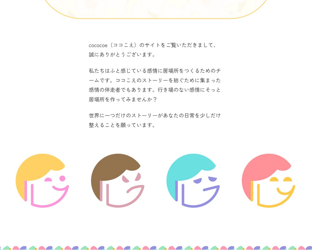
Led the VI design and web development for "cococoe," a service dedicated to providing a "place for emotions." The primary challenge was translating the abstract concept of emotional well-being into an intuitive and trustworthy digital experience accessible to a diverse demographic.
[2]
Goals
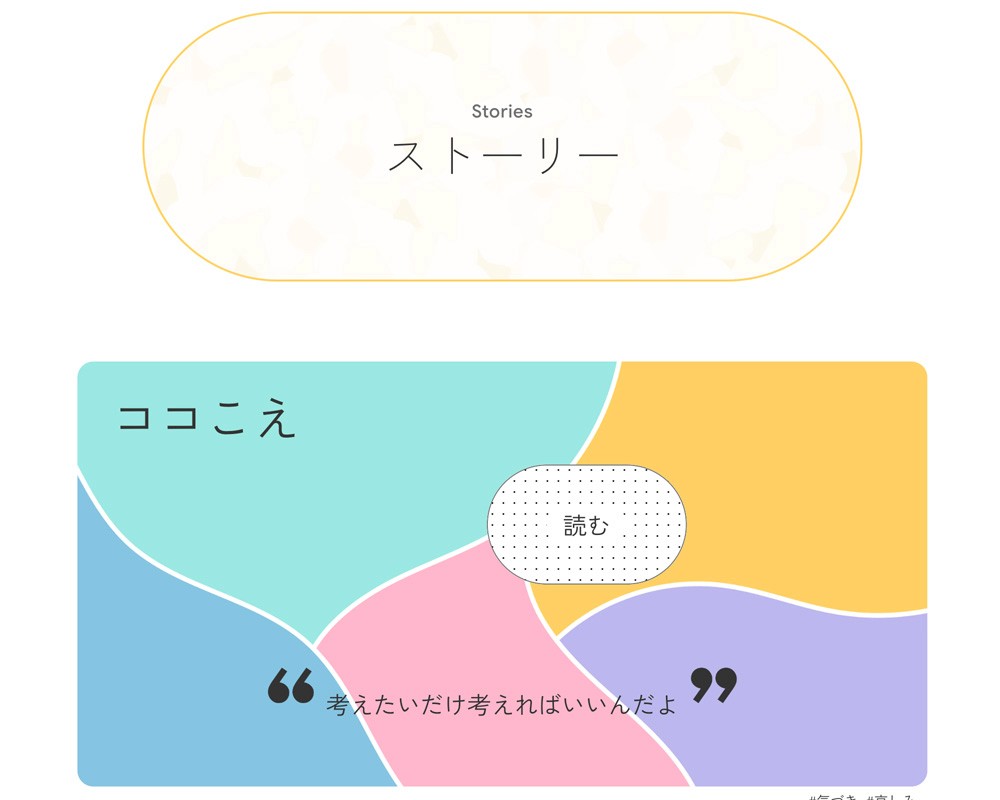
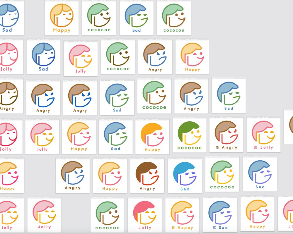
Established a visual language that balances approachability with professional credibility to reduce friction for first-time users. Developed an Information Architecture (IA) prioritized by user intent, ensuring a seamless flow from conceptual understanding to CTA engagement. Implemented micro-interactions symbolizing "emerging emotions" to deepen the user's connection with the brand core.
[3]
Insights
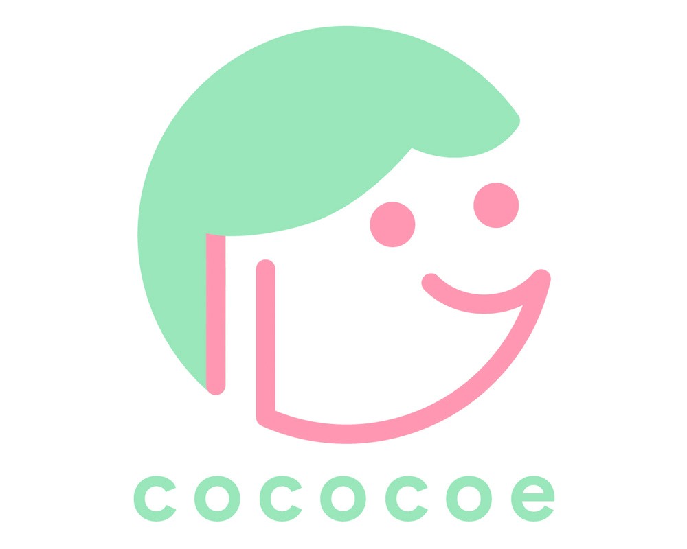
The VI centers on a geometric face icon derived from the kanji for "heart" (心), bridging cultural resonance with universal symbolism. For typography, Google Sans and Zen Kaku Gothic New were selected to ensure high legibility and a modern, transparent feel. The color strategy employs a vibrant yet balanced palette designed to validate emotional diversity, shifting the perception of emotions from something heavy to something manageable and positive.
[4]
Outcome
The implementation of interactive elements and emotional iconography successfully translated the brand’s core values into a tangible user experience. By maintaining a minimalist structure, I ensured high usability while reinforcing the brand's friendly image. The project resulted in a cohesive identity that effectively communicates the service’s unique value proposition to its target audience.

cococoe
Direction
UI/UX Design
Branding
Framer Development
[1]
Overview
Led the VI design and web development for "cococoe," a service dedicated to providing a "place for emotions." The primary challenge was translating the abstract concept of emotional well-being into an intuitive and trustworthy digital experience accessible to a diverse demographic.
[2]
Goals
Established a visual language that balances approachability with professional credibility to reduce friction for first-time users. Developed an Information Architecture (IA) prioritized by user intent, ensuring a seamless flow from conceptual understanding to CTA engagement. Implemented micro-interactions symbolizing "emerging emotions" to deepen the user's connection with the brand core.
[3]
Insights
The VI centers on a geometric face icon derived from the kanji for "heart" (心), bridging cultural resonance with universal symbolism. For typography, Google Sans and Zen Kaku Gothic New were selected to ensure high legibility and a modern, transparent feel. The color strategy employs a vibrant yet balanced palette designed to validate emotional diversity, shifting the perception of emotions from something heavy to something manageable and positive.
[4]
Outcome
The implementation of interactive elements and emotional iconography successfully translated the brand’s core values into a tangible user experience. By maintaining a minimalist structure, I ensured high usability while reinforcing the brand's friendly image. The project resulted in a cohesive identity that effectively communicates the service’s unique value proposition to its target audience.