


Kigamittsu
Direction
UI/UX Design
Framer Development
[1]
Overview
Led the full renewal of the corporate website for Kigamittsu, a graphic design studio, following their office relocation. To address the accessibility issues of the previous site, I built the website to maximize its functionality as a professional portfolio through both strategic design and Framer implementation.
[2]
Goals
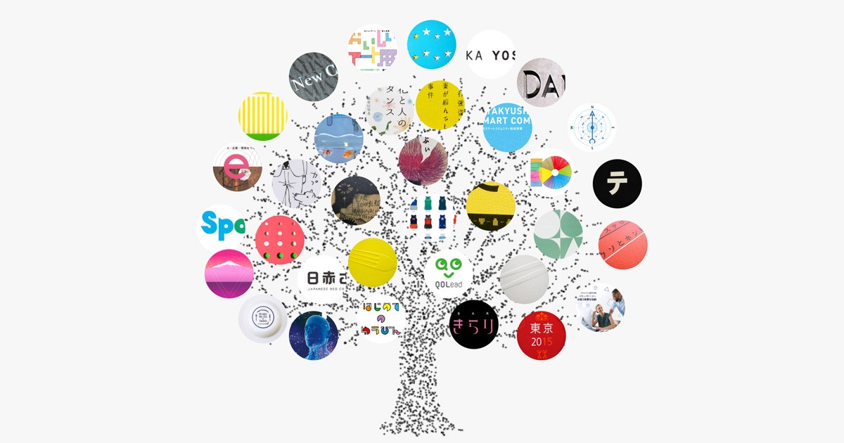
Designed a noiseless UI to ensure the creative works remain the primary focus, adhering to a minimalist aesthetic. Symbolized the brand identity on the top page through geometric elements inspired by the company's name ("tree"), establishing an abstract yet cohesive visual anchor for the site. Developed an intuitive flow to eliminate friction between pages, encouraging users to explore the portfolio extensively.
[3]
Insights
To prioritize a seamless browsing experience, loading animations were optimized to trigger only once per session. In the Works detail pages, I implemented a vertical-to-horizontal scroll interaction. This design decision maintains conventional scrolling behavior while providing a dynamic visual narrative, enhancing the presentation of the portfolio without compromising usability.
[4]
Outcome
Leveraged Framer’s CMS to establish a sustainable workflow that allows for rapid updates without compromising design flexibility. By implementing a high-performance loading sequence and a clear navigation system indicating user location, I delivered a stress-free, high-fidelity digital experience that aligns with the studio’s aesthetic standards.

Kigamittsu
Direction
UI/UX Design
Framer Development
[1]
Overview
Led the full renewal of the corporate website for Kigamittsu, a graphic design studio, following their office relocation. To address the accessibility issues of the previous site, I built the website to maximize its functionality as a professional portfolio through both strategic design and Framer implementation.
[2]
Goals
Designed a noiseless UI to ensure the creative works remain the primary focus, adhering to a minimalist aesthetic. Symbolized the brand identity on the top page through geometric elements inspired by the company's name ("tree"), establishing an abstract yet cohesive visual anchor for the site. Developed an intuitive flow to eliminate friction between pages, encouraging users to explore the portfolio extensively.
[3]
Insights
To prioritize a seamless browsing experience, loading animations were optimized to trigger only once per session. In the Works detail pages, I implemented a vertical-to-horizontal scroll interaction. This design decision maintains conventional scrolling behavior while providing a dynamic visual narrative, enhancing the presentation of the portfolio without compromising usability.
[4]
Outcome
Leveraged Framer’s CMS to establish a sustainable workflow that allows for rapid updates without compromising design flexibility. By implementing a high-performance loading sequence and a clear navigation system indicating user location, I delivered a stress-free, high-fidelity digital experience that aligns with the studio’s aesthetic standards.